Of all the composition rules in photography and filmmaking, the rule of thirds is probably the most well-known. It is a mainstay of the cinematographer’s work because it is so effective at inserting tension into a scene while at the same time giving space. Composing scenes using the rule of thirds keeps things dynamic. But, there are times when breaking the rule of thirds is exactly what you need to do. Here, we look at how using the rule of thirds in filmmaking will strengthen it, but how breaking it is effective, too.
What is the rule of thirds?
The rule of thirds is one of the core principles of photography and film composition. It divides each shot into nine equally sized rectangles, using 2 evenly spaced vertical lines and 2 evenly spaced horizontal lines. The 4 intersections of these lines are known as powerpoints. They are considered as the perfect position to place key elements in your scenes, for example, the eyes or heads of your characters, or vital subject
The dividing lines, which are often called tri-lines, can be used for aligning characters or objects vertically, or for lines that divide the scene horizontally, for example, the horizon or a shoreline. Unless you are looking to deliberately divide your scene symmetrically, for example, to enhance a reflection, you will often find that splitting it along the middle can make it feel static and dull. Following the rule of thirds grid to divide things a third of the way down, up, or across the scene will feel more alive.
This timelapse has the horizon on the upper tri-line and the sun on the upper right powerpoint.
Here, the central split works because of the reflection in the scene.
How to combine movement with the rule of thirds
Combining the rule of thirds with camera movements isn’t necessarily as tricky as you might think it could be. Maintaining the rule of thirds with a dolly-in, dolly-out or truck shot is fairly straightforward.
There is plenty of movement in this shot, but the subject’s head and eyes are always on the top right powerpoint.
If you’re using a pan shot, it’s always important to compose the scene where you start and to compose the scene where the camera comes to rest. Both of these could well benefit from using the rule of thirds.
There are different types of focus in film that you might want to consider and composing, for example, rack shots with an eye to the rule of thirds will help to maintain your audience’s attention as you switch focus from one powerpoint to another.
Examples of the rule of thirds in filmmaking
Artlist’s stock footage section has some excellent examples of the rule of thirds in filmmaking, but you can see it in use everywhere from breakfast television to soap operas, Hollywood movies to big-budget television productions.
The Queen’s Gambit, with its intense chess match scenes, is chock-full of compelling uses of the rule of thirds.
Source: Netflix
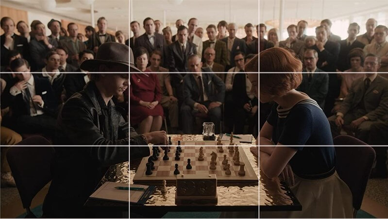
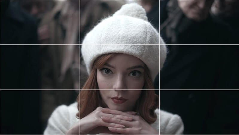
The eyes in this scene are powerpoint perfection, and given how busy it is, it ensures that the audience knows instinctively where to look.
Source: Netflix
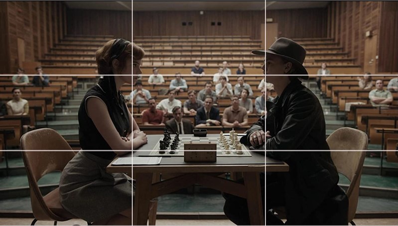
This scene is rule-of-thirds perfection.
Source: Netflix
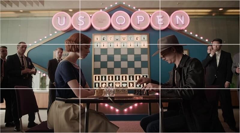
This one isn’t exact, but it is close enough and it looks beautiful.
However, cinematographer Steven Maizler put it to use in many other respects, too.
Car scenes are perfect vehicles (pun absolutely intended) for the rule of thirds:
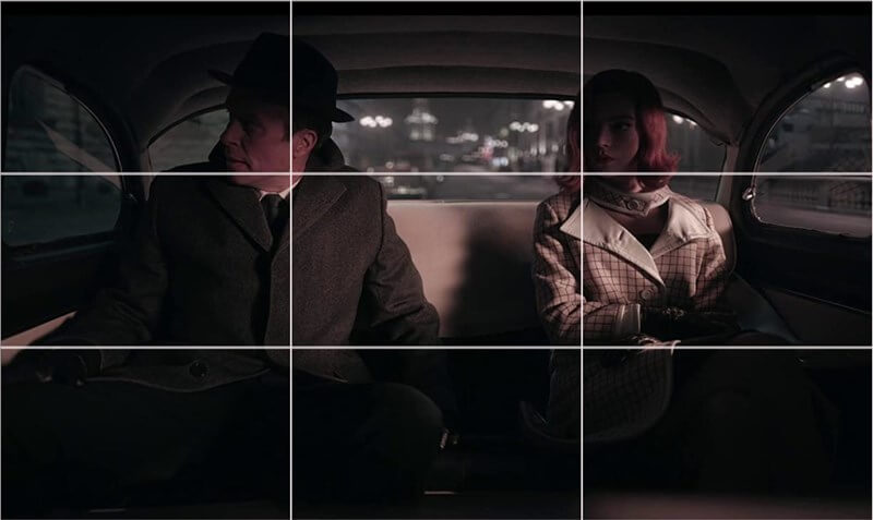
Source: Netflix
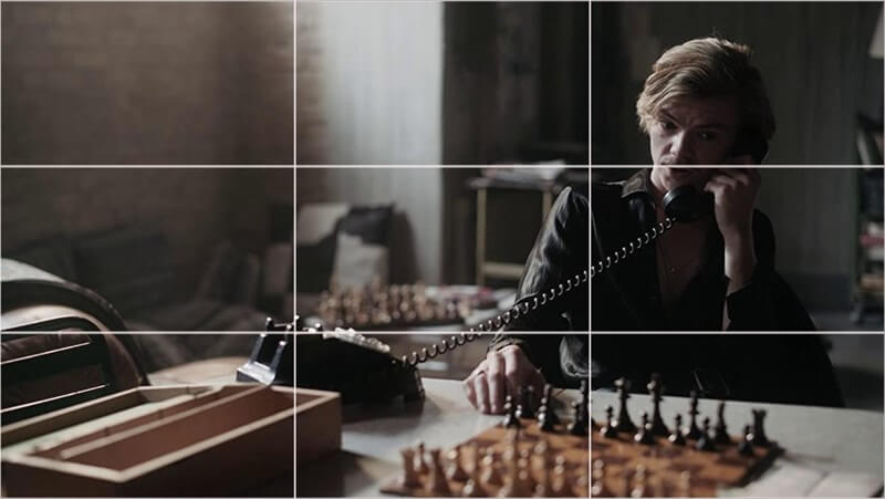
Not only is Benny’s head perfectly placed on the upper right powerpoint, but the telephone cord forms a superb leading line to the telephone in the lower left.
Source: Netflix
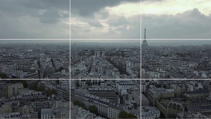
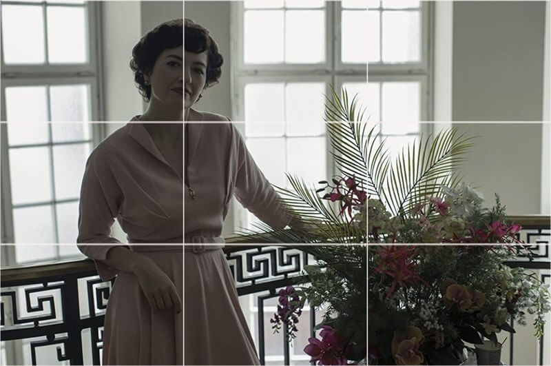
The horizon is on the upper tri-line and the Eiffel Tower is on the upper right powerpoint. This is a great demonstration of the rule of thirds, with a clear focal point emerging from the enormity and potential of the city.
Source: Netflix
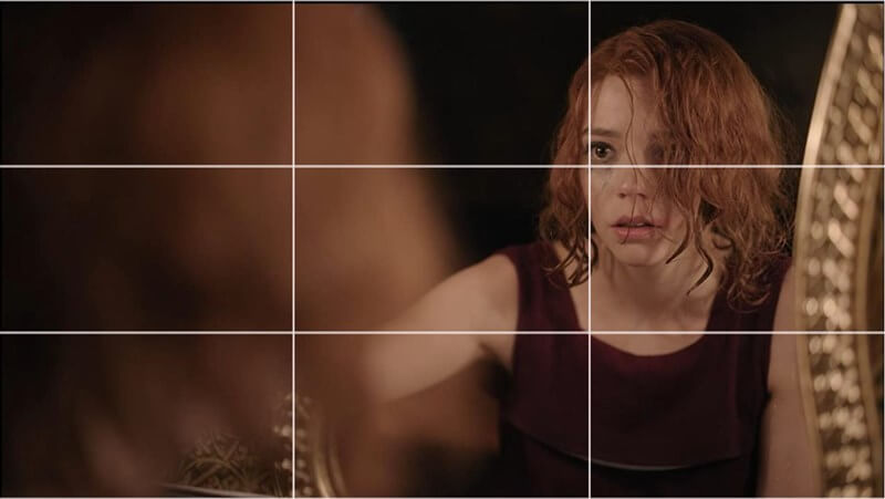
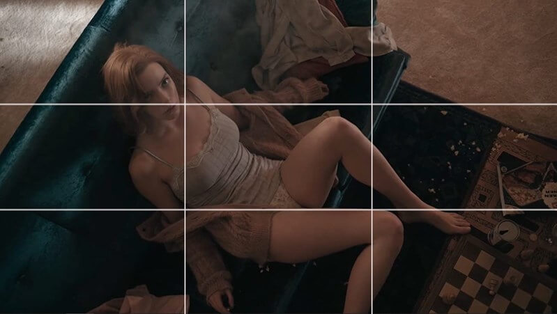
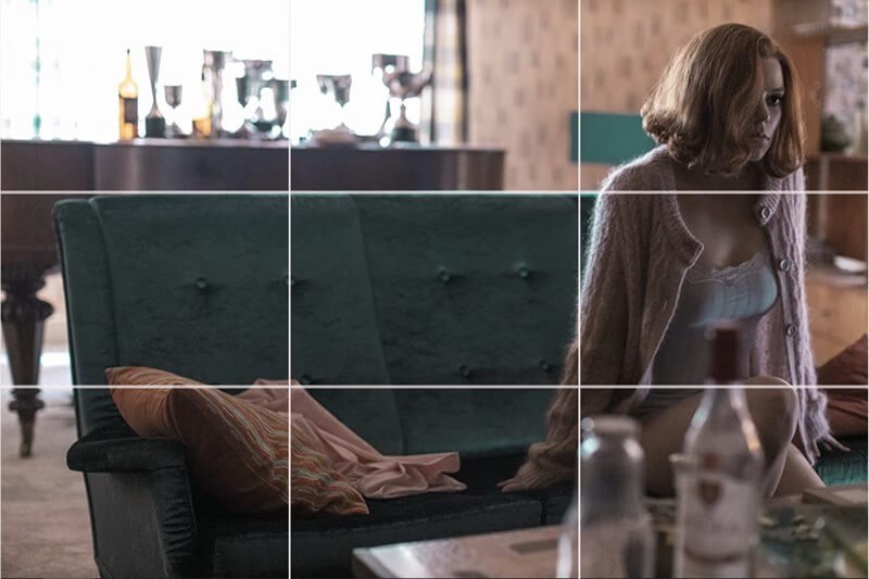
This is a dramatic shot where almost half of the frame is taken up by Beth’s out-of-focus hair, but her face reflected in the mirror is situated on the upper right powerpoint. This makes what could potentially be a confusing scene much easier to navigate for the audience, but it doesn’t lose its intensity.
Source: Netflix
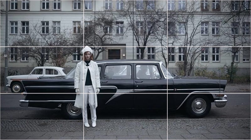
Here, Beth’s mother stands on the left vertical; the flowers balance her in the lower right.
Source: Netflix
This scene uses a strong diagonal, but Beth’s head in the upper left is balanced against her foot in the lower right.
Source: Netflix
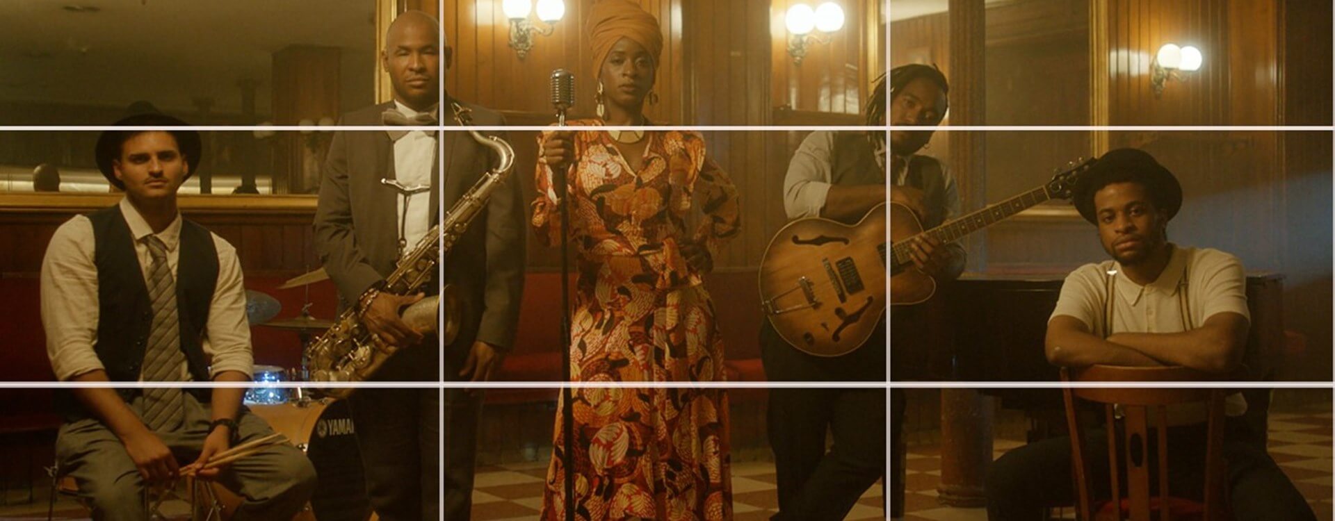
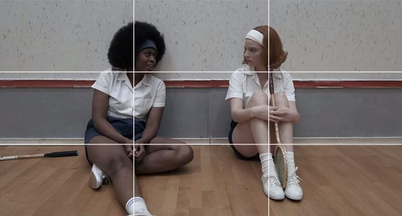
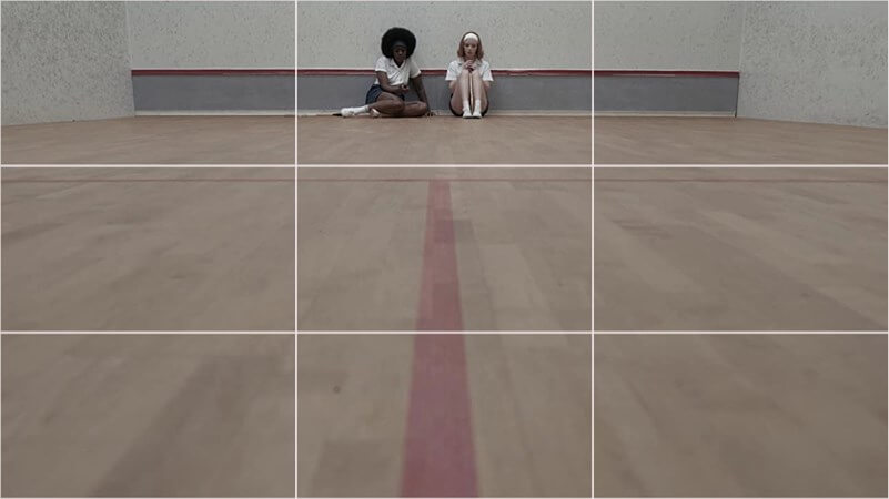
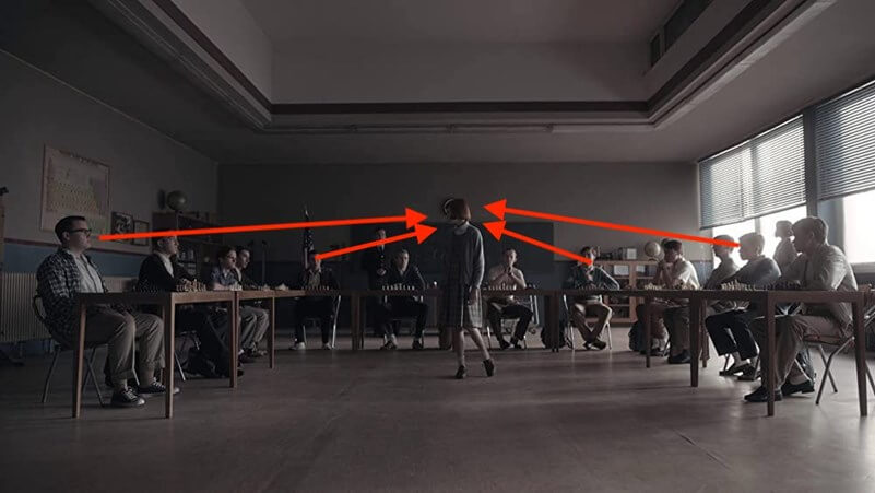
This shot makes excellent use of the rule of thirds, with Jolene’s and Beth’s heads on the upper powerpoints and their bodies following the vertical tri-lines.
Source: Netflix
Look at the white vertical and the black horizontal lines running through this scene. They align beautifully with the rule of thirds and the monochrome geometric shape reinforces the 1960s setting of the show.
Variations on the rule of thirds
As well as using the tri-lines and powerpoints for subject placement, you might also want to think about using the sections created by the tri-lines for subject placement. For example, with 3 people in a scene, separating them into the 3 vertical sections of the scene will balance it.
The golden rectangle is similar to the rule of thirds but brings the tri-lines slightly closer to the center of the scene. Some people regard it a little more elegant than the rule of thirds. It’s up to you which you prefer, and you might find that you use both, neither, or one more frequently than the other.
Breaking the rule of thirds
The rule of thirds is an effective composition tool that maintains dynamism in a scene. But sometimes, it doesn’t work how you want it to. You might want to introduce a different sense of tension into a scene. You might want to direct your audience’s attention elsewhere. You might want to increase the intimacy with a different shot. Or you might want to emphasize natural scenery. In which case, breaking it is the right thing to do.
As well as using the rule of thirds beautifully, The Queen’s Gambit regularly breaks the rule of thirds to stunning effect. This is a small selection of examples where Maizler breaks the rule of thirds.
Source: Netflix
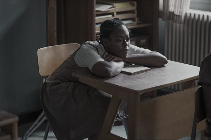
Here, centering Beth in the frame intensifies the audience’s focus on her and creates an intimate link between her and the viewers. This scene comes toward the end of the series, where Beth faces choices about her future. Can the audience get into her head to understand what she is thinking? The use of black and white–also the colors of a chessboard–enhances the intensity of the scene.
Source: Netflix
This scene has a very distinct leading line that brings the eyes up to Beth and Jolene at the top of the frame. As characters, they have come a long way. Where are they going now?
Source: Netflix
Beth is far to the right in this shot and looking out of the scene. It emphasizes how unbalanced she is at this point in her story.
Source: Netflix
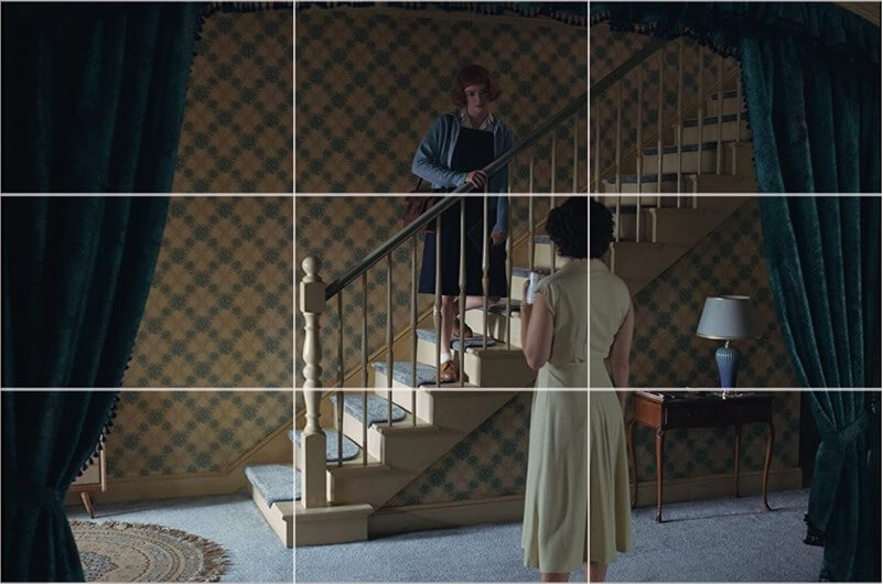
The curtains are used to frame this shot, which really draws attention to the exchange happening between Beth and her mother. Having them both toward the center of the frame emphasizes Beth speaking down to her mother and the evolving power dynamic between them.
Source: Netflix
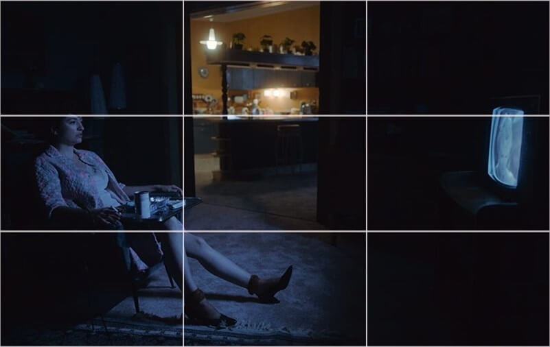
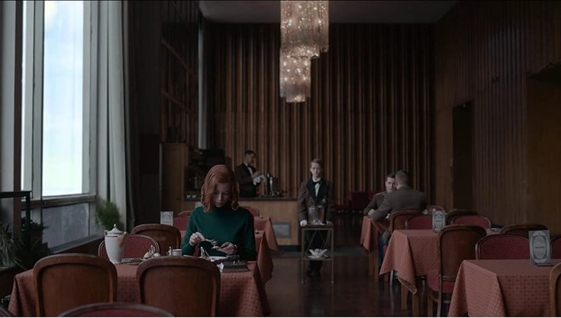
This scene is beautifully balanced and the expanse of space between Beth’s mother and the TV set gives it a sense of loneliness. If it had adhered to the rule of thirds, it would have felt too close and almost intimate.
Source: Netflix
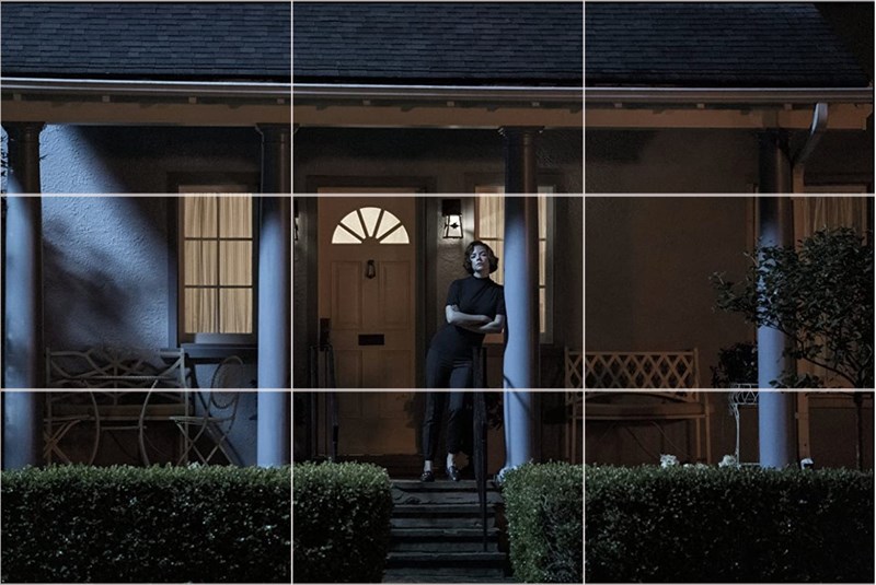
If this shot had adhered to the rule of thirds, it would have felt too squashed. Instead, there is a sense of space and openness to it that contributes to its elegance.
Source: Netflix
This scene is about confrontation, with the tension coming not just from the subject placement, but the multiple eyelines, too.
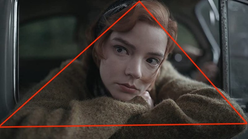
It’s also worth looking at how Maizler used triangles, quads, layers and encircling setups, too:
Notice here how Jolene and Beth fill the frame as a triangle, and how their arms can be used to draw focus to their faces.
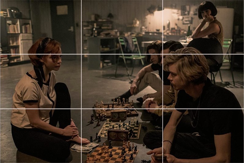
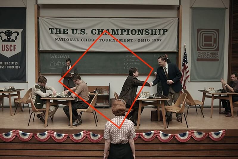
Here, there is a banner announcing the tournament, two games taking place immediately beneath it, and then Beth at the foot of the frame. It’s a quadrilateral formation that’s pleasing to the eye and helps to establish where Beth is and what she’s seeing.
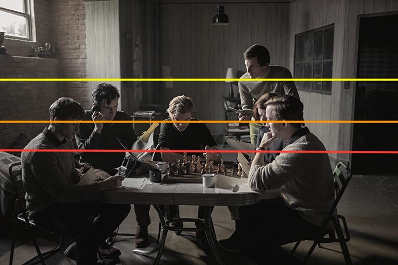
Some scenes have been composed so that the characters are layered through them. Sometimes it helps to emphasize the tension in the scene, with the audience captivated by the game and at others it almost contributes to showing an isolated Beth, eating alone. But it always gives depth to the shot.
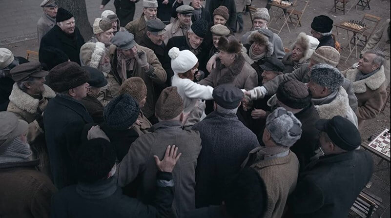
In these scenes, Beth is encircled by other people–mostly boys or men, in fact–making her the absolute center of attention. In one scene, it is intimidating and in another is celebratory but the subject is clearly surrounded.
Wrap up
Whenever you watch a television show or a movie, note when the cinematographer or DP uses the rule of thirds and when they break it. Ask yourself, how has it been broken, and what impact does this have on the scene. The more you look, the more you’ll see. With this, you’ll become more comfortable knowing when and how you can break the rule of thirds, too.