
Color Theory is all about understanding a viewer’s subconscious reactions to the colors you use in your videos. The theory tells us which color hues and values evoke a particular mood or atmosphere in a video.
What is color theory?
Color theory can be used to build your film world, create a consistent tone and feel, and even transition the viewer between locations, periods and emotional states. Also, using color theory, you can adjust the same shot from a spooky horror film to a period-set summer movie.
The impact of color in videos
Color plays a massive part in setting the tone and mood of your videos. In Hollywood, there are fantastic examples of films built around color theory. You may immediately recognize some genres by their color profile; Sci-fi, Westerns, War films, and period content all have particular looks, achieved using color grading.
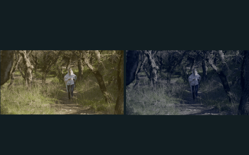
The Matrix is a fantastic example of using color theory principles to significant effect. At the same time, the movie sticks to the traditional green and blue hues of the sci-fi genre; it uses colors to transition the audience from the Matrix world to the real world.
In the horror series, The Haunting of Hill House, color theory moves the viewer between the past, present and dream-like sequences. For example, the cold blue grade of the flashback scenes works perfectly with the present’s desaturated greens. And the dreams take on a glowing sepia tone. This works because it follows color theory.
It’s easy to understand how color can play a huge part in films and TV shows, but content creators can also use color theory to improve their videos. Depending on your content, you can use color to create a mood or feeling in your viewer.
The 3 aspects of color
There are 3 aspects of color, each of which can be controlled independently to create your color look. Creating cinematic grades requires a careful balancing act between these 3 aspects.
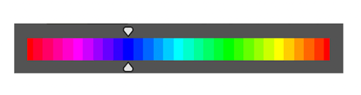
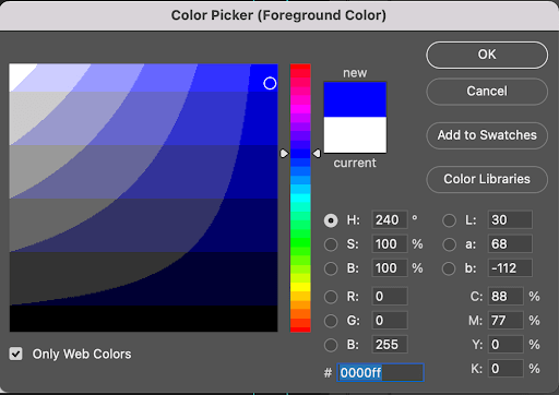
Hue
Hue is what many people would consider ‘color’ in general terms. But in video editing, the hue is the base color; blue, green, yellow, etc.
Saturation
Saturation refers to just how much of that color there is. By adjusting the saturation, you can create a duller or brighter color. For example, saturation is the difference between a dull blue and a bright blue.
Value
The value of a color is how light or dark it is, which can be adjusted by adding white or black to the base color. The value is the difference between a light blue and a dark blue.
What is a color scheme?
A color scheme is a group of complementary colors that can be used together to create the look of your video without them clashing. Basically, in films, there are 5 color schemes you can use: Complementary, Achromatic, Triadic, Analogous and Monochromatic.
If you’re looking for some clips to test these grades, Artlist offers unlimited downloads, including ungraded LOG footage.
Complementary
A complementary color scheme picks 2 colors from opposite ends of the spectrum. The most common palette for movies is Orange and Teal, which creates a stark contrast between areas in your shot.
Achromatic
An achromatic color scheme is the absence of any hue, black and white video. While you remove the color by decreasing the saturation, your chosen colors can still affect your shot.
Triadic
Triadic color schemes take 3 hues spread evenly across the color wheel such as pink, blue, and yellow. The aim is to reduce the blending of colors and create the hyper-vivid world you often see in Sci-fi or cyberpunk style compositions.
Analogous
Analogous color schemes use a group of hues from the color wheel, such as yellow through to red. All of the colors used will blend into one another, giving a temperature to your grade. You see this in many horror films where the grade is pushed to an overall cold blue tone.
Monochromatic
As the name suggests, a Monochromatic color scheme uses a single color but plays around with the value and saturation to create depth in the scene. Monochromatic color schemes are used in a lot of sci-fi films and thrillers.
Wrap up
Whether you’re making narrative films or vlogging for YouTube, color theory can help you improve the look of your content and the experience for your viewers. Ultimately, Color Grading is about making your shots look nice while complimenting your story. Color theory is a fantastic guide to understanding those complementary palettes.